Hi Folks,
With this blog post we thought we’d take you through the colouring process of our new up-coming comic ‘Problems with Dragons’. Firstly below you can see the work done by inker Billy Browne who did the cover.
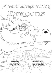
In fact Billy went and did a second one as well with more detail to give the future colourist options. Here’s the second option.
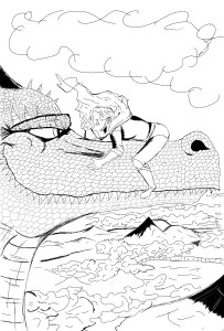
As you can see this has a lot more detail done in ink with more blacks being put into the cover. It was at this stage that we hired Anthea West as the colourist after seeing the good work she had done on the cover of The Earthbound God.
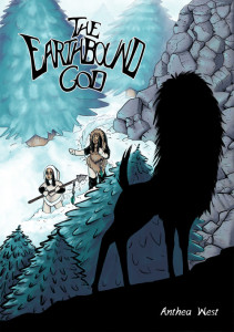
Here is the cover for the ‘Earthbound God‘. What impressed us about this cover was the use of black in it. The book is about the hunt for an Earthbound God. As you can see Anthea who drew and wrote the book did a fantastic cover and had the verve and imagination to use the blacks to her advantage. The outline of the God is there but it is still in darkness; we can tentatively see it but it is still an enigma to us. There are other things; how the cover transitions from the bottom right hand corner to the left hand corner in brightness. As well as the perspective of the tress which get less detailed as we move away creating a scene of depth. The first tree is strongly inked while the tree behind the two hunters is just done in colour with little or no inking touching it. Yep we liked her work. So anyway after she agreed to come on board. The next part was her deciding what cover to colour. My money was on the strong blacks or cover two but instead she picked panel one. Which goes to show you why I don’t gamble.

Now that the cover was decided it was time to colour. Yay! The first thing was actually deciding on what colours to choose! Anthea gave us this to look at.
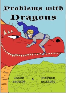
So this was the colours chosen by Anthea and I have to say I was surprised. I always pictured the Dragon as green. Him being a huge reptile and all. After seeing this it made perfect sense. If you are doing a cover you need your main character to ‘pop’ from the page. It’s the reason why most superhero’s have primary colours in their costumes. The background colours are meant to be slightly duller so your eye is automatically drawn to the figures involved. It’s why our knight has a cloak of deep blue to stick out against the light blue sky behind him.
With the colours picked we also noticed a problem with the knights face.

As you can see by the picture above the knights face which looked fine in black and white took on another appearance in colour. The eye just looked strange and the mouth seemed to close to the hair. Obviously this was going to need tweaking if we wanted him to look his best.
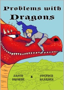
With the colours picked Anthea moved on to detailing the cover. The Dragon was up first and he was looking good. Also scroll back up and look at the difference his expression takes when he is coloured rather than inked. Above his expression is one of amusement. When he was scaled in ink he looked way more insidious. Unfortunately the knights face still looked odd.
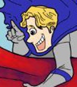
The mouth looked a lot better. As the the eyes… Oy! More work was obviously needed. So on to draft three!
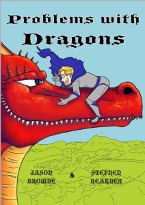
In the third draft the Dragon got his finishing touch’s done. The horns on the head and a little more shading done. Check out the teeth! As for our knight…

Sometimes less is way more. We just went with good ol’ black and white which sorted him out nicely. With the Dragon done and our Knight looking human. It was time to kick on and finish him.
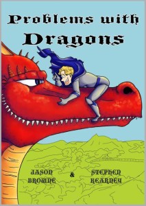
Don’t they look pretty? Are two main guys were done and looking awesome so now it was the backgrounds turn.
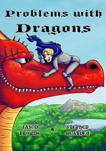
Take a long look at the difference it makes. Suddenly are two guys are inhabiting a world around them. While the strong colours of our two main characters means that they pop and your eye is automatically drawn to them. The knight also got another makeover.
So that was the cover. As you can see it isn’t just a colour by numbers gig and the difference more or less inking can make are huge. Luckily we had two very talented folks who worked on this to bring out the best in Steve Kearney’s original art. So hopefully this has given you a deeper understanding of colour and how the relationship between the inker and colourist can be vital.
Until next time folks!
